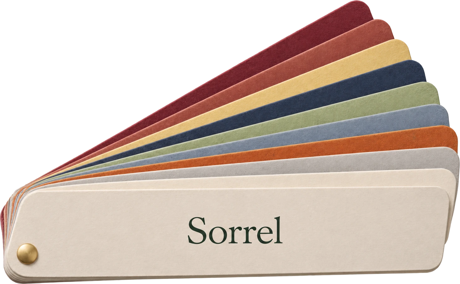
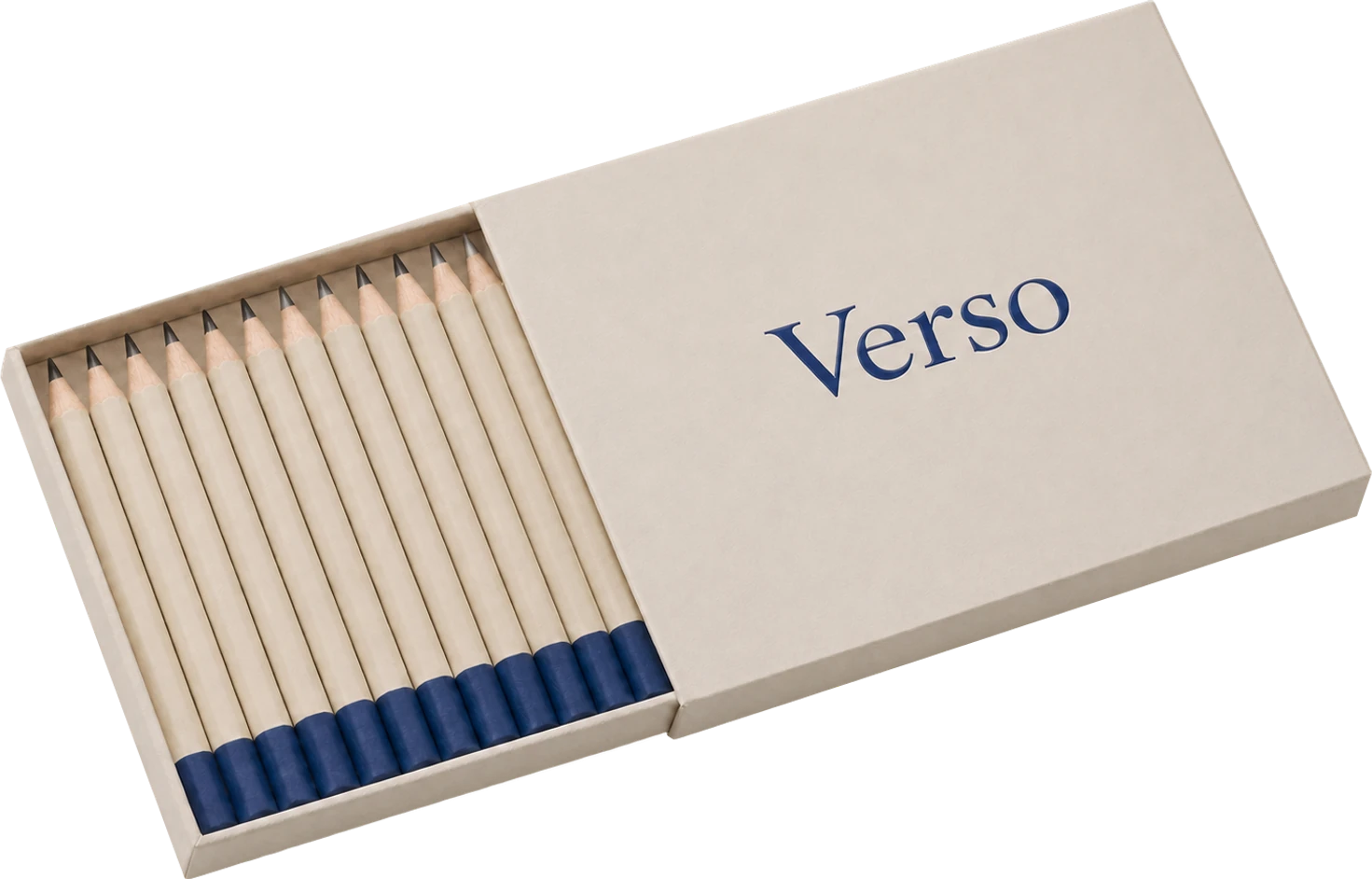
Every colour on a printed piece is a separate plate on the press. Each plate has to be made, mounted, inked and lined up with the others. Between jobs, each ink has to be washed out.
None of this is visible to the person holding the box. All of it is on the invoice.
What Verso printed before
Over sixty years, Verso had collected five brand colours. Each notebook, pencil box and bag used two or three of them, in different combinations. Every reprint meant matching old colours on new paper.
What one colour changed
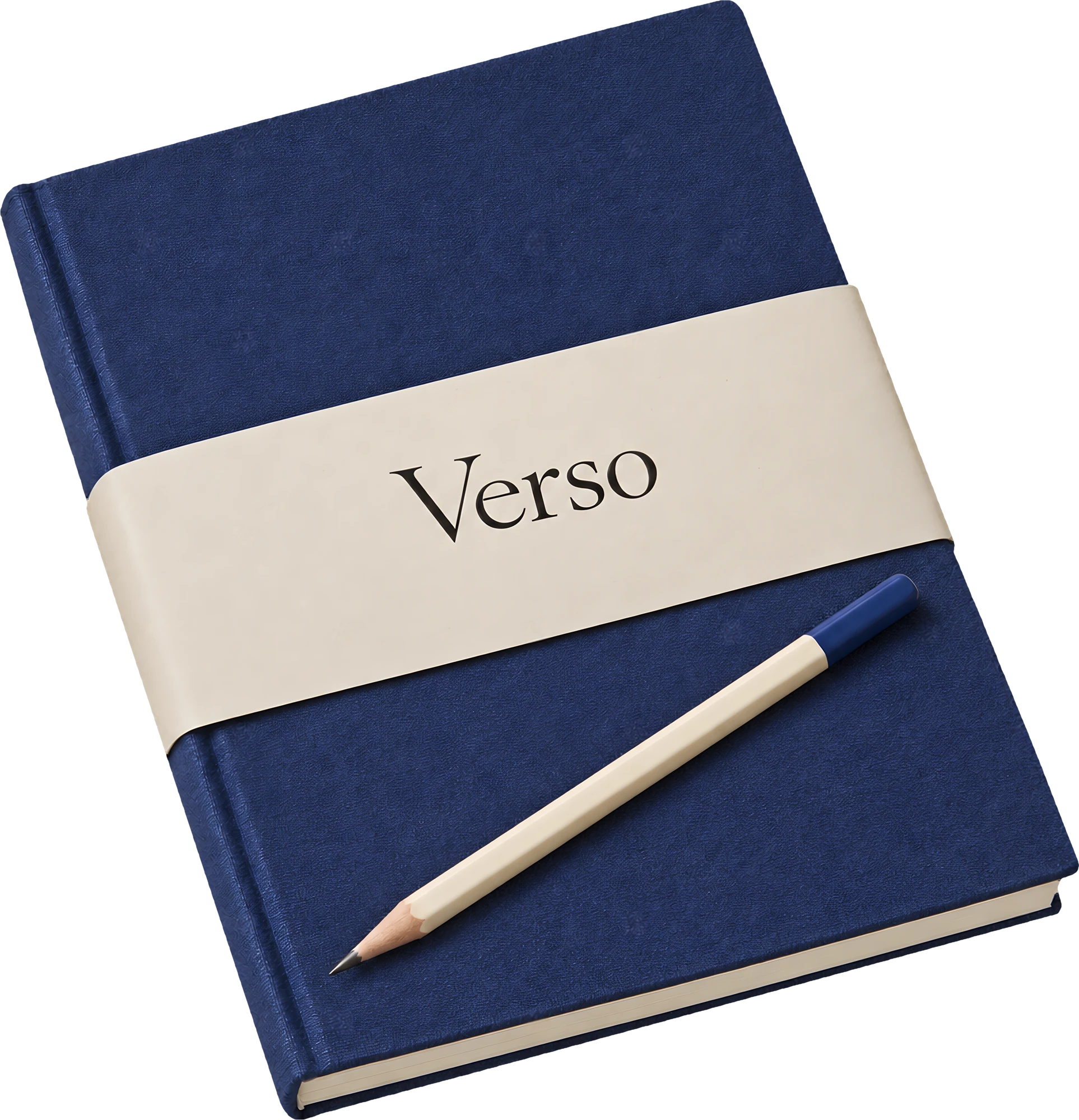
When we moved the whole range to one blue, three things happened:
- Fewer plates. Most pieces went from three plates to one.
- Less drift. One ink is easy to keep consistent across a run, and across years of reprints.
- Less waste. Fewer wash-ups and fewer make-ready sheets cut the ink and paper thrown away by about two fifths.
The cheapest colour is the one you do not print.
What it costs
One colour is a discipline. It means the paper and the material carry more of the design, so they have to be chosen with care. For Verso, the cream paper and the bookcloth became as much a part of the brand as the blue.