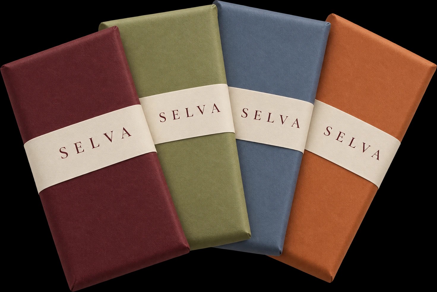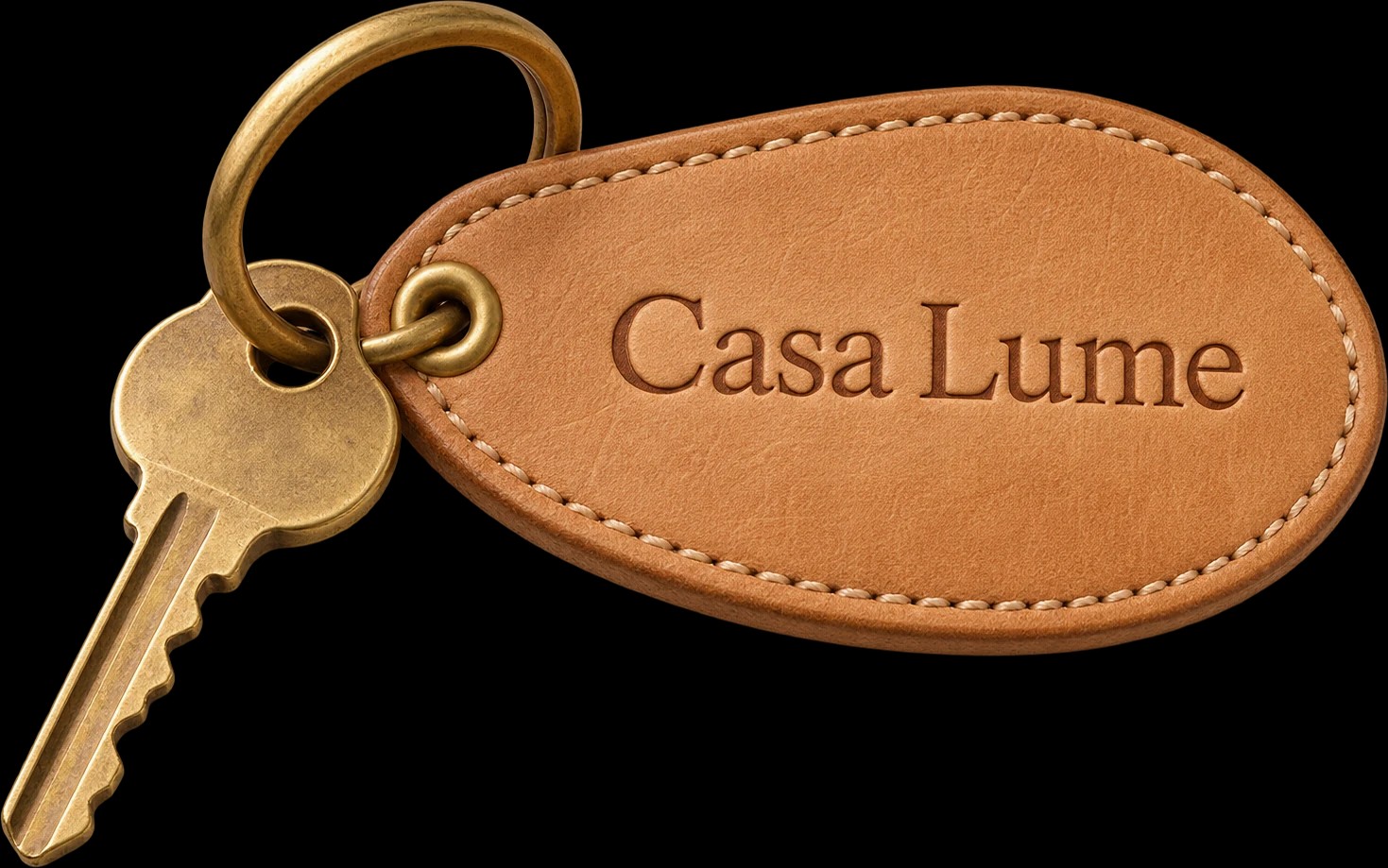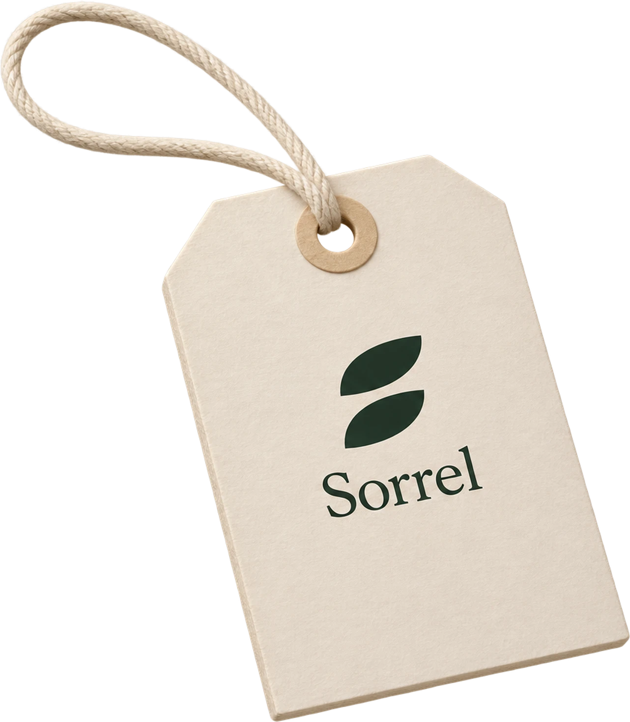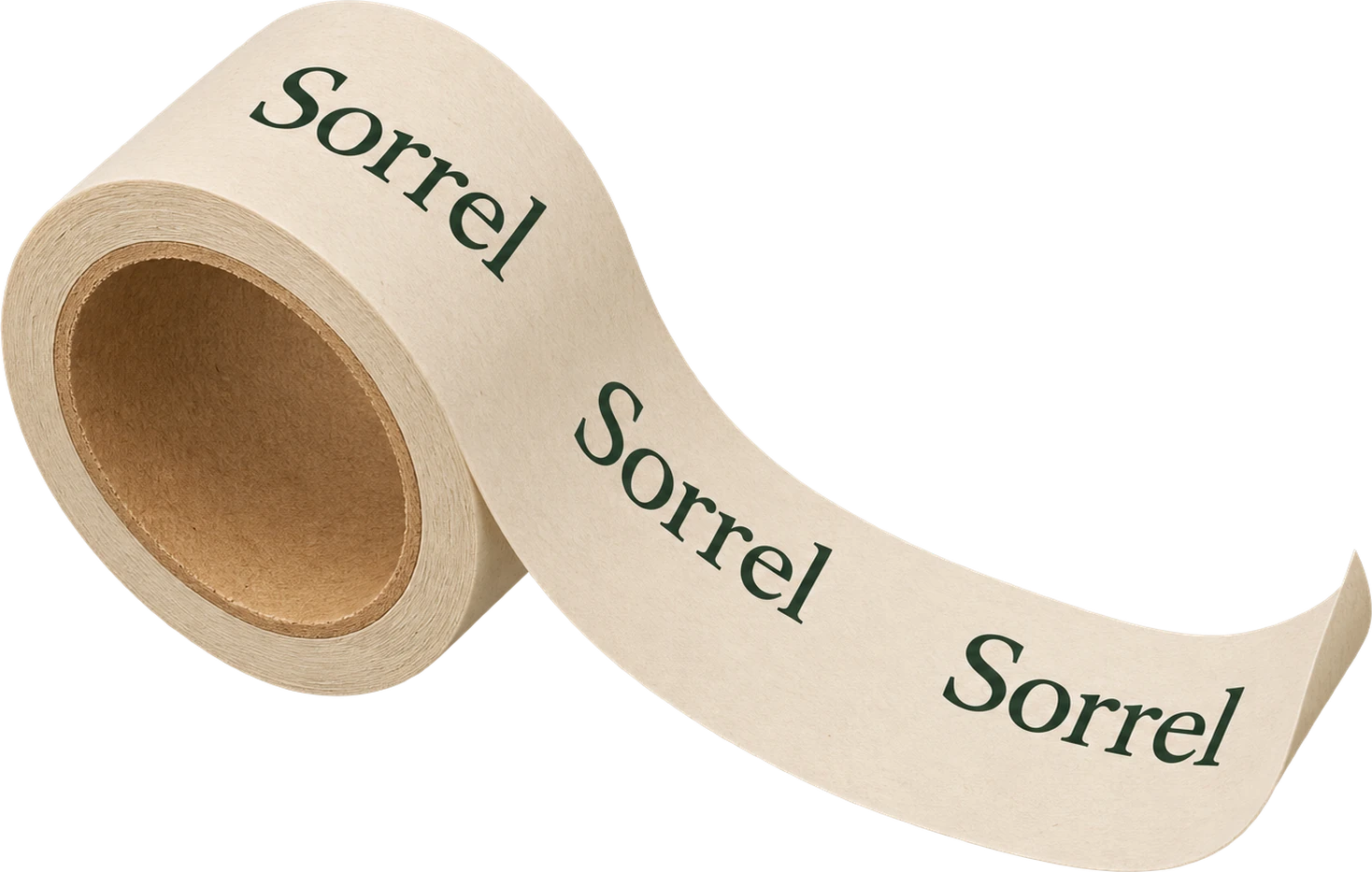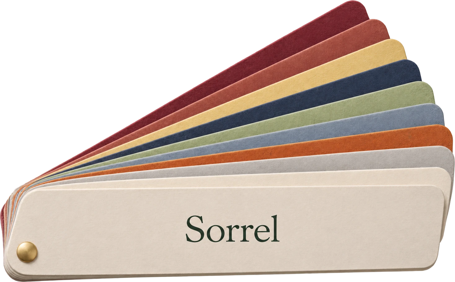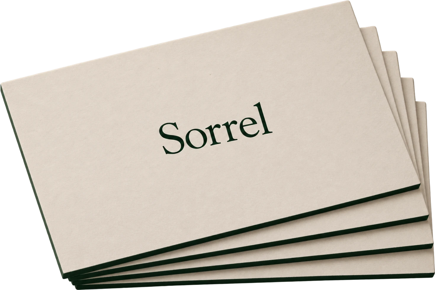
Most naming meetings happen in front of a screen. A list of candidates, set in one typeface, side by side. People vote, and the name that wins is the one that looked best on a slide.
Then it goes on a box, and something is wrong.
Names live on objects
A name on a product is never alone. It sits on a texture, at a size, next to a fold, under a thumb. A name that reads beautifully at sixty points can turn into a smudge at nine.
So we print every name before anyone chooses it:
- On the real material. Bookcloth, kraft, frosted glass, whatever the product will wear.
- At the real size. The smallest place the name will ever appear, not the largest.
- In the hand. We pass the samples around the table and watch which ones people pick up.
What changes
The name that wins on paper is rarely the one that won on the list. Short names gain. Names with round letters gain on rough paper. Names with fine strokes lose on kraft.
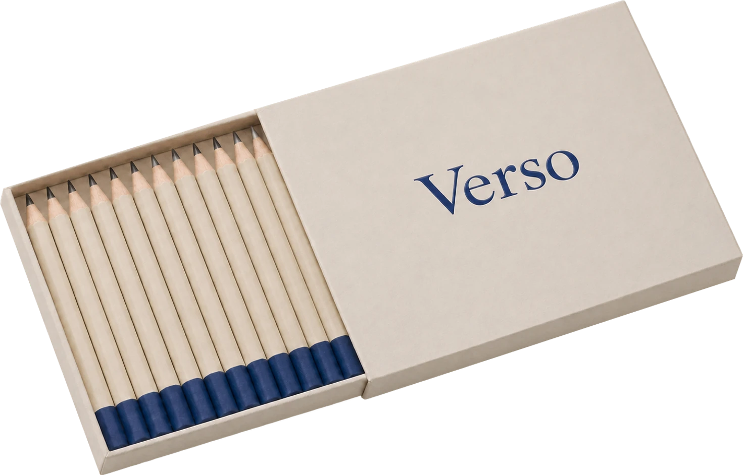
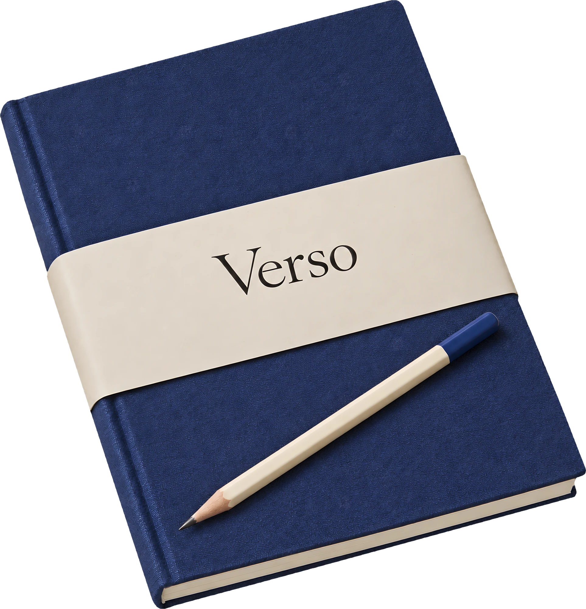
For Verso, the client's favourite on screen was a longer word. On a bookcloth band, at notebook size, it lost to five letters that sat on the cloth as if they had been there for sixty years.