The brief
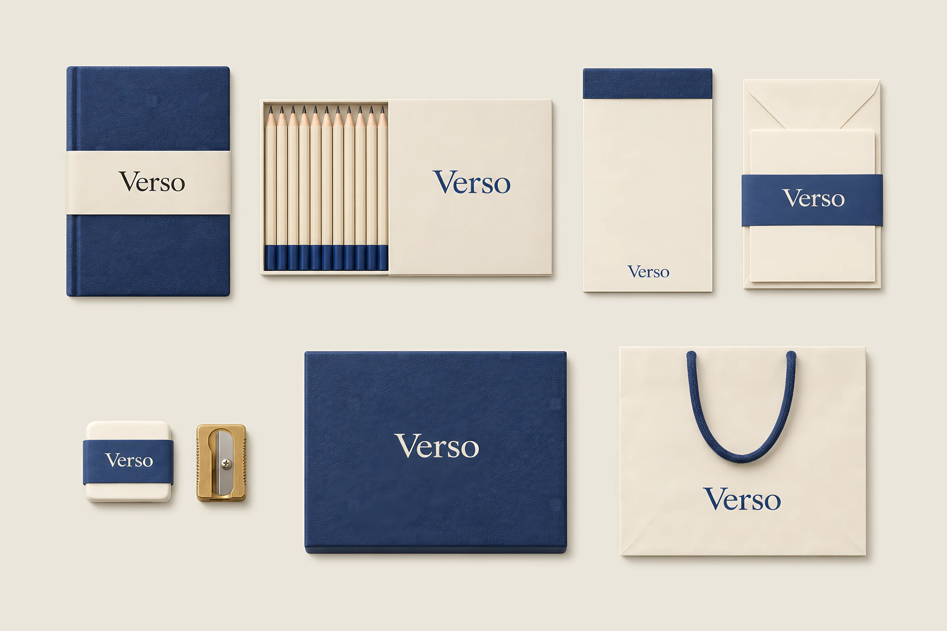
Verso has made notebooks in Copenhagen since 1961. Over sixty years it had collected five colours, three logos and a range nobody could see as one family on a shelf.
Anders Holm asked for a new logo. We suggested something smaller.
What we made
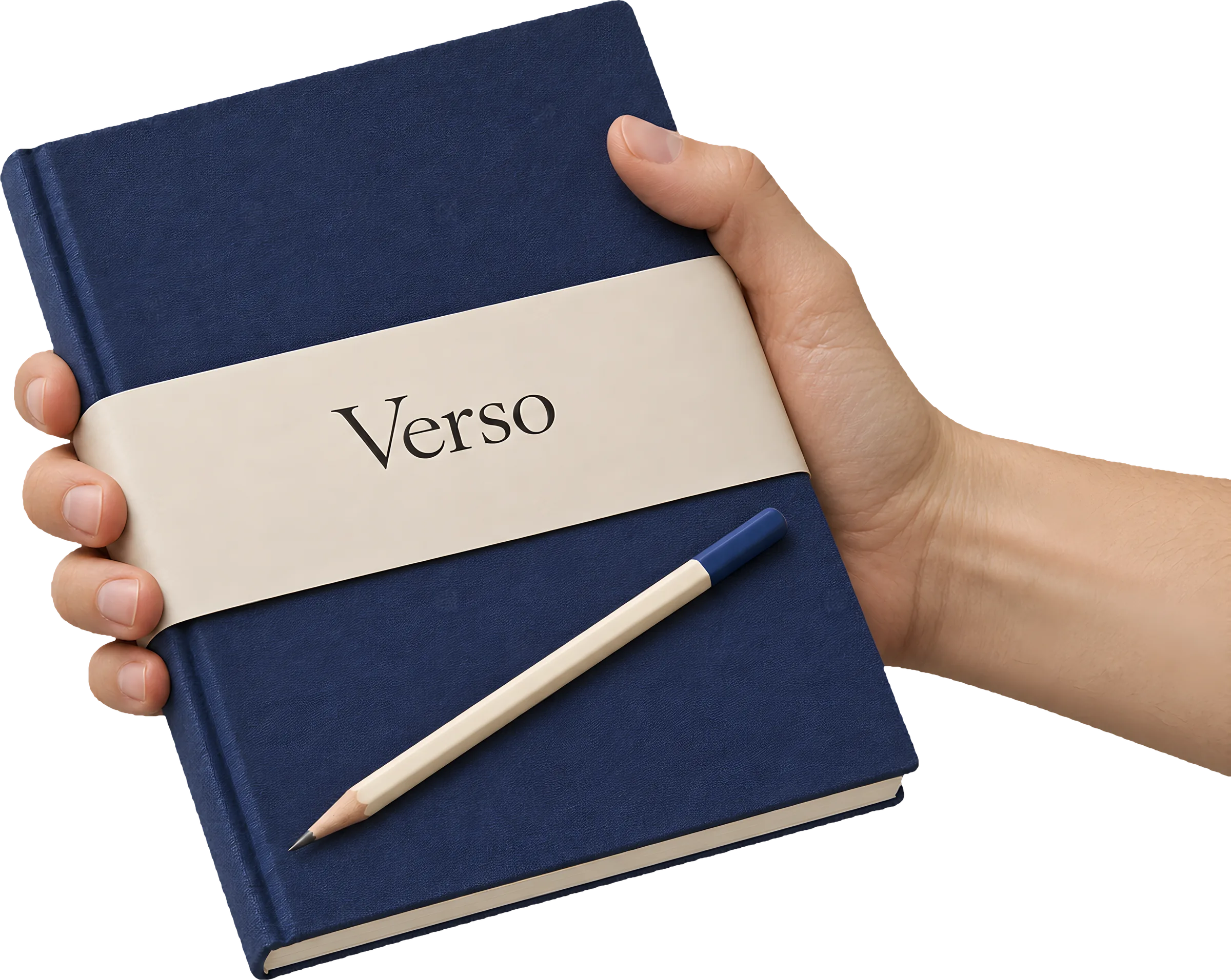
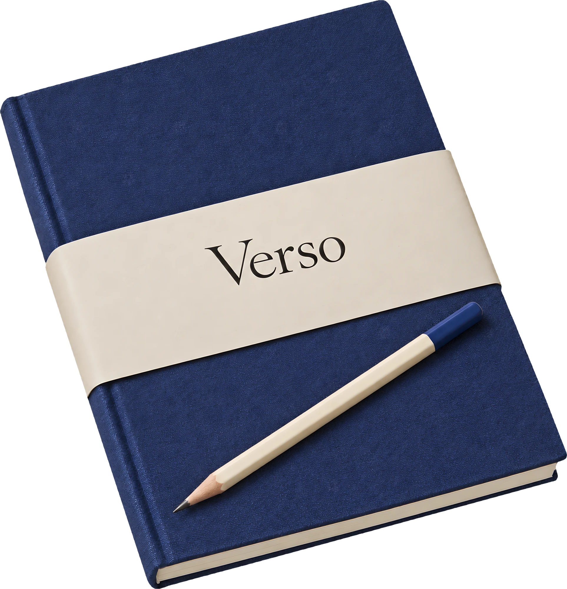
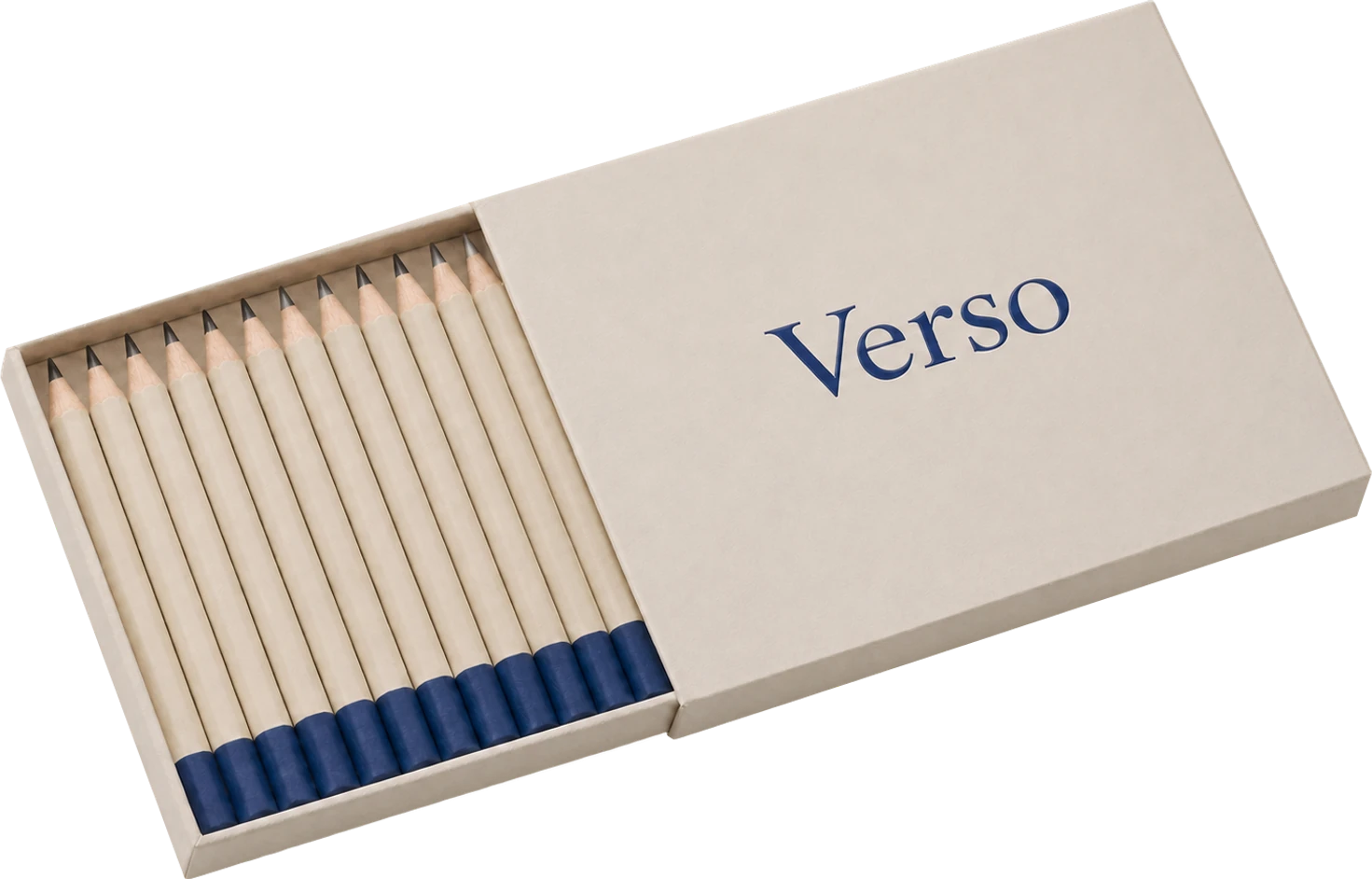
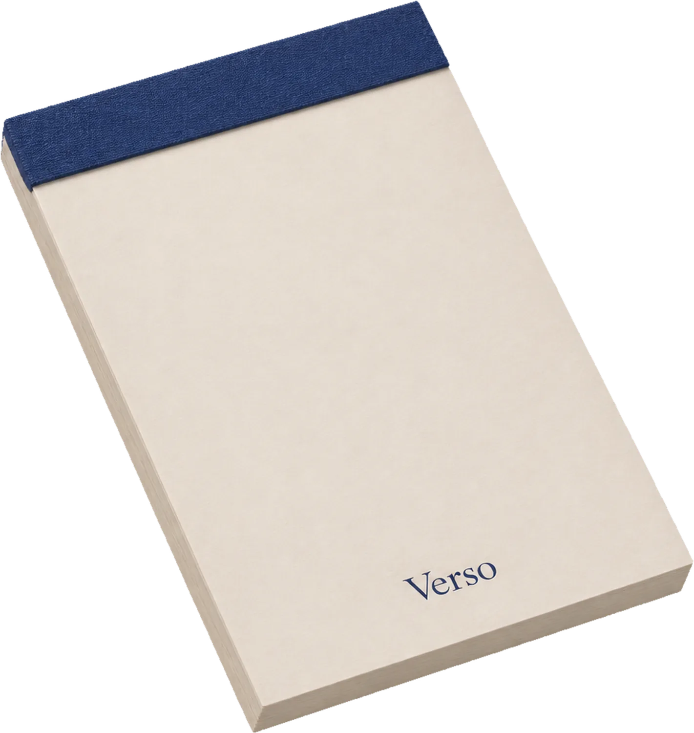
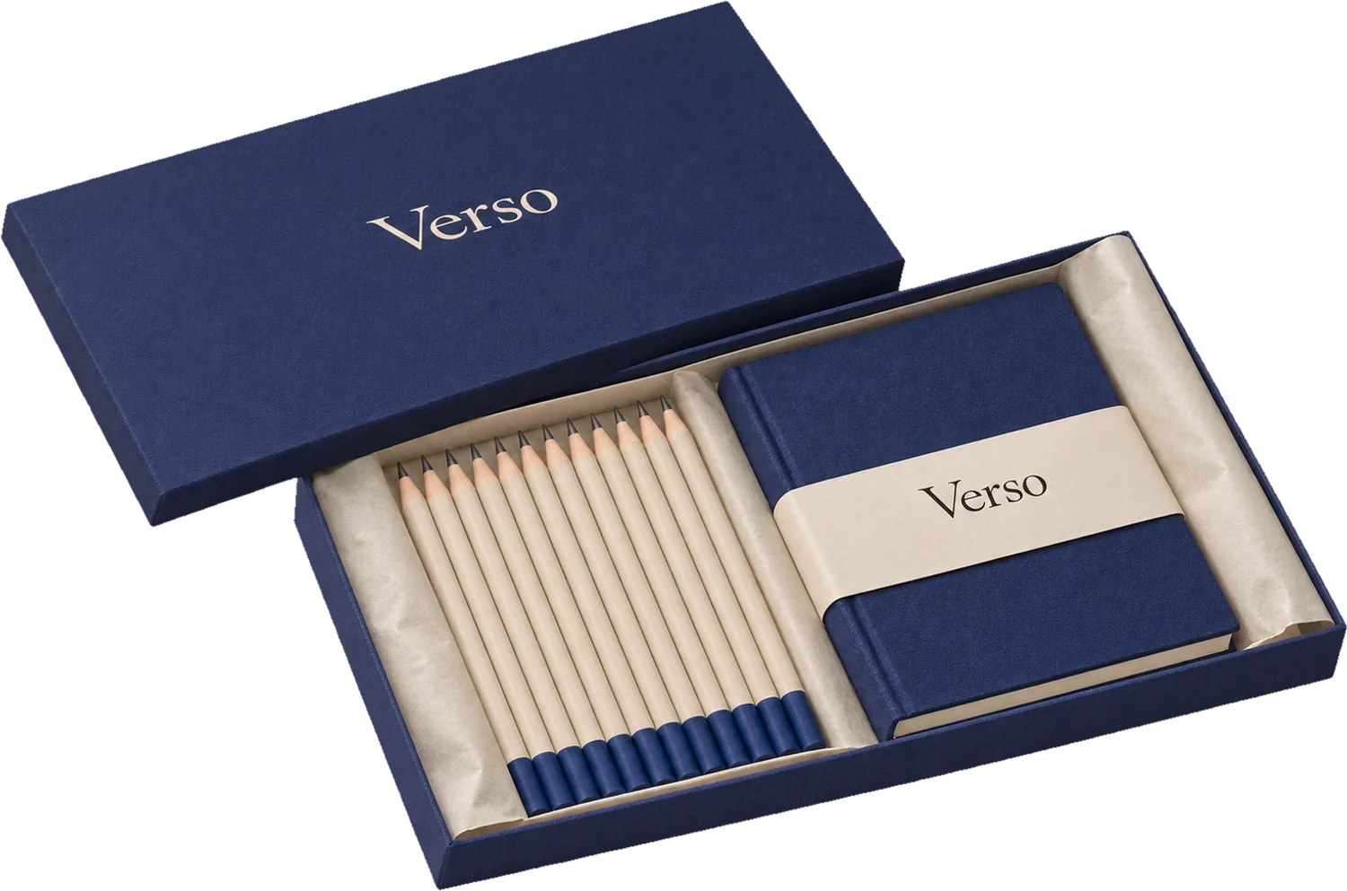
- One blue. Every Verso product now wears the same ink blue and the same cream, from the notebook to the eraser sleeve. Nothing else is printed.
- A wordmark set in a quiet serif, small, always on a cream band, so the cloth and the paper do the work.
- Twenty-two products, one system. We drew a simple rule for where the band sits on every size, so new products arrive already designed.
- Less ink on press. One colour across the range cut the printing bill and the waste by two fifths.
What changed
For the first time, Verso's range reads as one brand from across a shop. Two design shops in Tokyo now stock the full set.
We took away four colours. It was the most useful thing we did.